The Art of Choosing Paper for Letterpress Printing
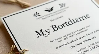
Not all paper is created equal! Letterpress printing, with its characteristic tactile impression, relies heavily on the paper’s ability to both accept and showcase that impression. Choosing the right paper is a critical decision, influencing not only the final visual appearance but also the feel and overall quality of your letterpress project. This guide explores the key qualities that make paper ideal for letterpress and how they impact your prints. Before diving into the intricacies of paper selection, it's helpful to appreciate the historical context. Understanding the evolution of letterpress, from Gutenberg's innovations to the modern revival, can give you a greater appreciation for the craft and the materials involved - you can read more about A Brief History of Letterpress: From Gutenberg to Modern Revival to explore this fascinating journey.
Understanding the Qualities of Letterpress Paper
When selecting paper for letterpress, you’re looking for a delicate balance of characteristics. Here's a breakdown of the most important factors:
Weight: The Foundation of Impression
Paper weight, measured in pounds (lbs) or grams per square meter (gsm), is arguably the most crucial element. Generally, letterpress printing works best with heavier paper stocks. Why? Heavier paper provides the density and substance needed to resist the pressure of the press and create a crisp, well-defined impression. The right paper weight is about more than just visual appeal; it dictates the entire printing process and the final product's durability.
- Too Light: Thin paper will buckle and tear easily under pressure, resulting in a distorted and uneven impression. Attempting to use overly light paper can actually damage your press and waste ink.
- Ideal Range: Generally, a weight of 80lb cover (216 gsm) or higher is recommended. Many letterpress printers prefer 100lb cover (270 gsm) or even heavier stocks. The specific weight will always depend on the intended use – a delicate invitation might handle a lighter weight better than a sturdy business card.
- Consider the Project: Invitations might benefit from a slightly lighter weight than a hefty business card or book cover. Think about the feeling you want to evoke. A substantial weight communicates quality and permanence, while a lighter weight can suggest elegance and delicacy.
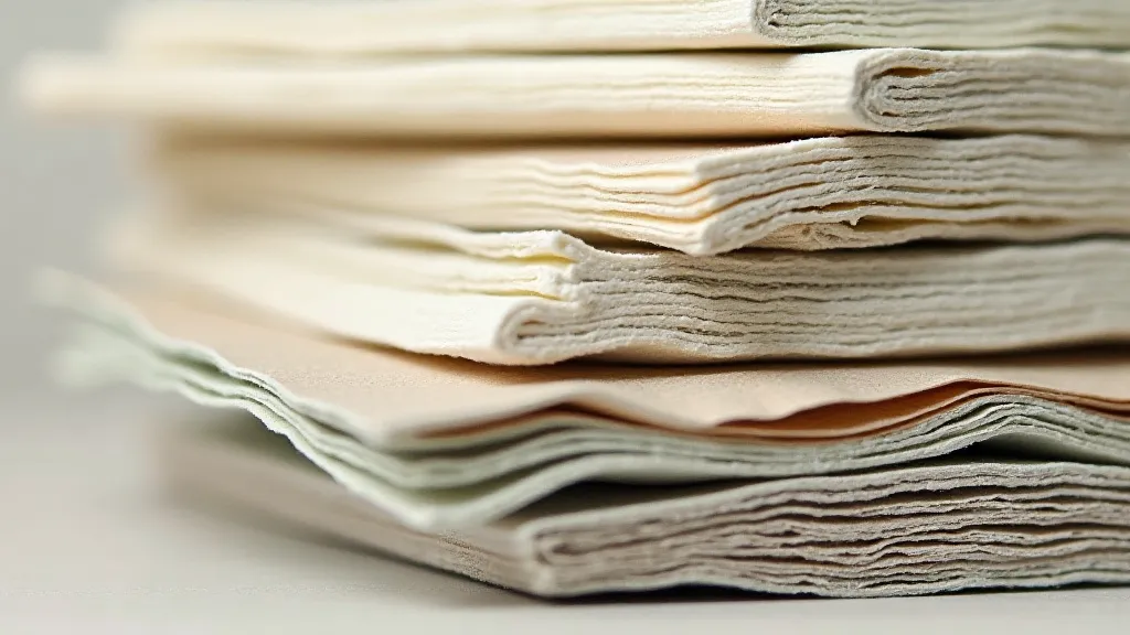
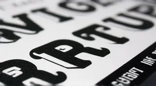
Texture: Adding Character and Feel
The surface texture of the paper dramatically affects the letterpress impression. Some textures enhance the tactile quality, while others offer a more refined look. Beyond the visual impact, texture plays a vital role in how the impression ‘reads’ to the touch. This is particularly relevant when working with intricate fonts, where the texture can emphasize the fine details.
- Felt/Laid: These papers have visible lines or a felted texture, adding a vintage or handcrafted feel. The texture provides a unique visual interest and can catch the light in interesting ways. These often pair beautifully with classic or vintage-inspired typography.
- Smooth/Crane: Smooth papers offer a clean, modern aesthetic. They allow the impression to be the primary focus, showcasing the sharpness of the type. This is a great choice for contemporary designs and minimalist aesthetics.
- Textured/Cotton: Cotton papers are often highly textured, offering a luxurious feel and a more pronounced impression. The texture interacts wonderfully with the ink, creating a beautiful depth and dimension.
Fiber Content: Cotton, Wood Pulp, and Beyond
The type of fiber used to create the paper influences its absorbency, durability, and overall feel. The inherent properties of these fibers directly impact how the ink interacts with the paper during the printing process. Choosing the right fiber content is a key decision that contributes significantly to the overall feel and quality of the final printed piece. Selecting the right paper isn't just about looks; it's about understanding how the material behaves under pressure and how it contributes to the tactile experience.
- Cotton: Considered the gold standard for letterpress, cotton papers are soft, absorbent, and have a beautiful drape. They create a luxurious impression and are more forgiving during the printing process. This is largely due to the natural fibers’ ability to cushion the pressure of the press.
- Wood Pulp: A more affordable option, wood pulp papers offer good printing qualities but often lack the luxurious feel of cotton. While they can produce a respectable impression, the result often lacks the depth and richness that cotton provides.
- Recycled: While increasingly popular for their sustainability, recycled papers can sometimes be more brittle and may require careful printing techniques. The process of recycling fibers can sometimes alter their structural integrity, making them less resilient under pressure.

Matching Paper to Your Design
The best paper choice is one that complements your design and intended aesthetic. Consider the following:
- Elegant Invitations: Opt for a luxurious cotton paper with a subtle texture like felt or laid. A classic serif font will enhance the timeless feel.
- Modern Business Cards: A smooth, high-quality paper stock will convey a sense of professionalism and sophistication. Complement this with a carefully chosen typeface - consider how the font’s character interacts with the paper’s surface. If you’re aiming for a truly unique look, exploring different typefaces can be incredibly rewarding – you can find plenty of inspiration on Choosing Your Type: A Guide to Letterpress Fonts and Styles.
- Vintage Postcards: A deckle-edged paper with a rustic texture can enhance the vintage feel. A hand-lettered font or a distressed typeface will perfectly complement the aesthetic.
Experimentation is Key
Ultimately, the best way to find the perfect paper for your letterpress printing is to experiment! Order paper samples and run test prints to see how different stocks respond to your press and design. The nuances of paper selection often become apparent only through practical experience. It’s about feeling the paper, observing how the ink takes, and appreciating how the texture interacts with the typeface.
Conclusion
Choosing the right paper is a fundamental aspect of the art of letterpress printing. By understanding the qualities of weight, texture, and fiber content, you can elevate your prints from ordinary to extraordinary. Embrace the process, experiment with different options, and discover the perfect paper to bring your letterpress vision to life! Furthermore, consider how your typographic choices will complement your paper selection – the two elements work in harmony to create a truly exceptional final product. The interplay between the tactile sensation of the paper and the visual impact of the typography is what elevates letterpress printing from a mere printing technique to a genuine art form.