Letterpress and Typography: A Perfect Partnership
Letterpress printing, with its characteristic deep impression and tactile quality, isn’t just about the physical process; it's intrinsically linked to the art of typography. The two disciplines have a long and storied relationship, elevating each other to heights that digital printing simply can’t replicate. Let’s delve into why these two are such a powerful combination.
The Tactile Enhancement of Typography
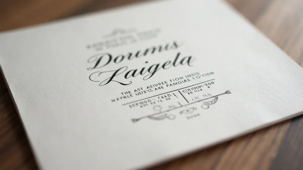
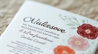
Typography, the art and technique of arranging type to make written language legible, attractive, and effective, relies heavily on visual appeal. However, letterpress printing introduces a crucial third dimension: touch. The slight debossed impression created by the press highlights the form and weight of each character in a way that a flat, digitally printed page cannot. This physical sensation enhances the reader’s connection to the text. A beautifully chosen typeface, such as a sturdy Garamond or an elegant Baskerville, gains an entirely new level of impact when pressed into paper.
Font Selection for Letterpress
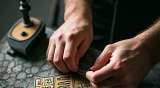
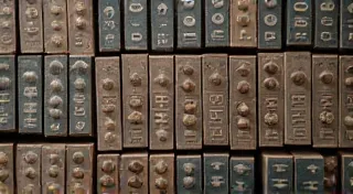
While virtually any font *can* be used in letterpress, certain typefaces are especially well-suited to the process. Fonts with strong contrast between thick and thin strokes often benefit most from the physical depth. The impression accentuates these contrasts, making the design more dynamic and visually engaging. Serif fonts, known for their traditional elegance, are a popular choice, as are bolder sans-serif fonts with clear, distinct lines. Delicate, hairline fonts, while possible, can be more challenging to execute flawlessly due to the pressure involved and risk of breakage or spreading.
The History of Collaboration
The close relationship between letterpress and typography isn't a modern phenomenon. It dates back to the invention of movable type by Johannes Gutenberg in the 15th century. Gutenberg's genius lay not only in creating a system of reusable type but also in recognizing the importance of typography itself. He understood that the beauty and legibility of the type directly impacted the success of the printed work. Early printers and type designers worked closely together, understanding that the physical properties of the printing process—the paper, the ink, the press—had to be considered alongside the aesthetic qualities of the font.

Design Considerations for the Letterpress Workflow
Designing for letterpress differs from designing for digital printing. Here are a few key considerations:
- Thickness of the Paper: Thicker papers generally handle the pressure of the press better and result in a more defined impression.
- Ink Coverage: Solid areas of ink require more pressure, which can increase the risk of paper distortion. Careful planning is crucial.
- Registration: Aligning multiple colors in letterpress can be more challenging due to the tactile nature of the process.
- Negative Space: The impression creates a three-dimensional effect, so negative space – the areas around the type – becomes even more important in creating balance and visual interest.
The Enduring Appeal
In an age dominated by digital reproduction, letterpress printing continues to resonate with those who appreciate the beauty of craftsmanship and the tactile connection to printed materials. The partnership between letterpress and typography is a testament to the power of blending art and technique, creating pieces that are both visually stunning and deeply satisfying to touch.