Choosing Your Type: A Guide to Letterpress Fonts and Styles
The selection of type is arguably the most crucial decision in any letterpress project. More than just choosing a pretty font, it's about choosing a typeface that communicates a feeling, reflects the project’s purpose, and – critically – works well with the unique characteristics of letterpress printing. This guide will explore different type classifications and offer insights into how to select the right typeface for your letterpress creations.
Understanding Type Classifications
Typefaces are broadly categorized, each with a distinct aesthetic and historical context. Understanding these classifications helps you choose fonts that align with your desired style and the project’s overall tone. Before diving into specific fonts, it’s worth noting the considerable craftsmanship involved in letterpress, extending beyond simple font selection. If you're new to the process, consider reviewing a beginner’s checklist to understand the essential steps involved.
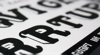
Serif Typefaces
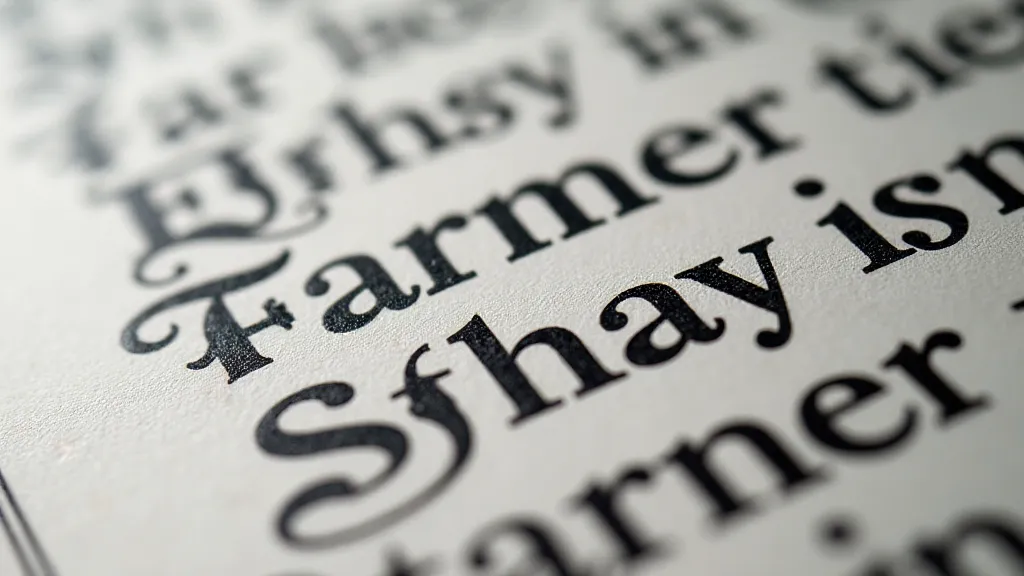
Serif typefaces, characterized by small decorative strokes (serifs) at the ends of letter strokes, evoke a sense of tradition, elegance, and authority. They’re often associated with classic literature, newspapers, and formal documents. The weight and contrast of these serifs are particularly important when considering letterpress, as they directly impact the impression depth.
- Old Style Serifs: These are the earliest serif fonts, often with low contrast and bracketed serifs (where the serif curves into the stem). Garamond and Caslon are quintessential examples. Their subtle details work beautifully in letterpress, lending a refined and historical feel. The nuanced interplay of ink and impression in these fonts rewards careful attention to detail.
- Transitional Serifs: A development from Old Style, Transitional serifs offer slightly higher contrast and more defined serifs. They balance legibility with a touch of elegance.
- Modern Serifs: Characterized by high contrast, thin strokes, and unbracketed serifs, Modern serifs project a sense of modernity and clarity. While impactful, they can sometimes appear stark in letterpress if not carefully chosen. They require precise ink coverage to avoid a patchy impression.
Sans-Serif Typefaces
Sans-serif typefaces, meaning "without serifs," offer a cleaner, more contemporary look. They're often used for headings, signage, and modern designs. Choosing the right sans-serif can be tricky, especially when aiming for a specific aesthetic. The early examples often have a unique, almost mechanical feel that can add character to a project. If you’re considering using traditional equipment, it's worth researching the history and upkeep of preserving letterpress equipment to ensure your chosen fonts can be effectively translated onto your press.
- Grotesque/Gothic: Early sans-serifs with a slightly mechanical feel.
- Neo-Grotesque: Refined versions of Grotesque fonts, offering improved legibility and a more balanced appearance.
- Humanist Sans-Serifs: These incorporate elements of handwriting, resulting in a warmer and more approachable feel.
Slab Serifs
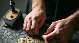
Slab serifs, also known as Egyptian fonts, are distinguished by their thick, rectangular serifs. They project a bold, confident, and often industrial feel. They’re incredibly well-suited for letterpress due to the strong impression they can create. The sheer boldness of slab serifs makes them ideal for creating striking visual statements. These fonts work best when the letterpress form is properly "locked up" – a precise and essential step in the printing process. Learning how to locking up a letterpress form is fundamental to achieving clean, crisp impressions.
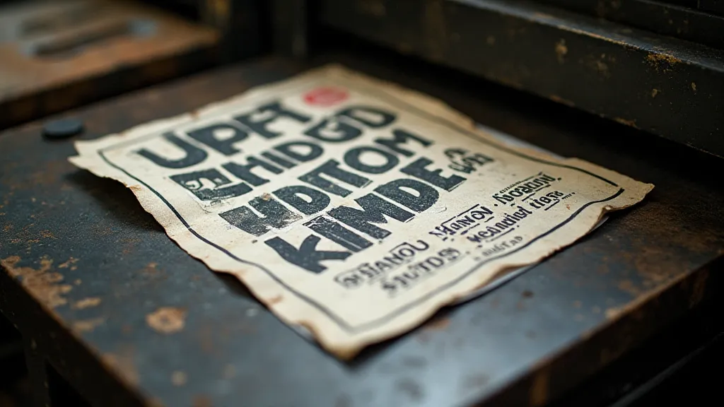
Considerations for Letterpress
Not all typefaces translate equally well to letterpress. Here are key factors to consider:
- Weight and Thickness: Heavier weights generally work better for letterpress as they create a more visible impression. Fine, delicate fonts can easily deform or break during the process. The interplay between the paper stock, ink type, and font weight is crucial for achieving the desired tactile effect.
- Spacing and Kerning: Letterpress often reveals inconsistencies in spacing and kerning. Pay close attention to these details and be prepared to adjust them. Subtle adjustments can dramatically impact the overall readability and aesthetic appeal.
- Ink Coverage: Typefaces with large open areas will require more ink and may lead to a less consistent impression. Careful ink management is essential for avoiding smudging and unevenness.
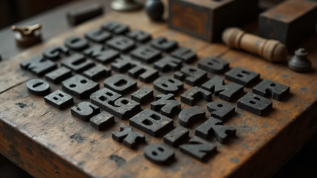
- Metal Availability: Historically, letterpress printing relied on metal type. While polymer plates are now common, the availability of metal type for specific fonts can still influence your choices. The resurgence of interest in letterpress has brought renewed appreciation for the artistry of traditional metal typefaces.
- Paper Selection: The type of paper used significantly impacts the final result. Thicker, textured papers are often preferred for their ability to absorb ink and create a more pronounced impression.
Font Selection and Style
Ultimately, the best typeface for your letterpress project depends on your aesthetic goals. Experiment with different styles and weights to see what works best. Don’t be afraid to combine different typefaces – a classic serif for the body copy paired with a bold sans-serif for the headlines can create a visually compelling effect. Understanding the historical context of letterpress printing also influences design choices. The future of letterpress hinges on innovation and adapting to new technologies while honoring its rich heritage. It’s fascinating to consider the future of letterpress and how emerging techniques might shape the art form.
Conclusion
Choosing the right typeface is a critical part of creating a beautiful and impactful letterpress project. By understanding type classifications and considering the unique challenges and opportunities presented by letterpress printing, you can elevate your work and create pieces that are both visually stunning and historically informed. The meticulousness required for letterpress ensures a uniquely crafted final product, a testament to both the designer’s vision and the printer's skill.