Ink and Color Mixing for Letterpress: A Practical Guide
Letterpress printing offers a unique tactile quality, and that’s often amplified by the richness and depth of color achieved through careful ink mixing. Beyond simply using pre-mixed inks, understanding the principles behind color mixing allows for truly unique and expressive results. This guide will cover the basics of color theory, the types of inks used in letterpress, and practical techniques to achieve stunning color effects. Whether you're just starting out or looking to refine your skills, mastering ink mixing is key to unlocking the full potential of letterpress printing.
Understanding Color Theory
Before you start blending, a grasp of color theory is essential. The basics revolve around the color wheel. Primary colors (red, yellow, blue) can’t be created by mixing other colors, but all other colors *can* be derived from them.
- Primary Colors: Red, Yellow, Blue.
- Secondary Colors: Created by mixing two primary colors (e.g., Red + Yellow = Orange).
- Tertiary Colors: Created by mixing a primary and a secondary color (e.g., Red + Orange = Red-Orange).
Understanding hues, saturation, and value is also crucial. Hue is simply the color name (red, blue, green). Saturation refers to the intensity or purity of the color (a bright red vs. a muted pink). Value refers to the lightness or darkness of the color (adding white increases value, adding black decreases it). It’s a fascinating area to delve into, and understanding these nuances can really help you anticipate how different inks will behave when mixed. For those new to the process, embarking on a simple printing your first letterpress project can build a basic understanding of these principles in a hands-on way.
Letterpress Ink Types
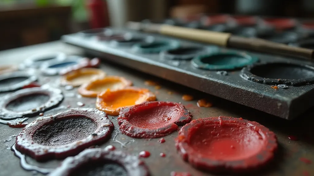
Not all inks are created equal! The type of ink you choose significantly impacts the final result. Here are some common letterpress inks:
- Oil-Based Inks: These inks offer excellent coverage and a beautiful drape on paper. They're generally more durable but require solvents for cleanup. They are favored for achieving deeper, richer colors and are a good choice when you want to experiment with complex blends.
- Water-Based Inks: Easier to clean up (soap and water!), water-based inks are often a good choice for beginners. They may not offer the same level of coverage or durability as oil-based inks. The ease of cleanup makes them a bit less intimidating, particularly when you're just starting to experiment with new color combinations.
- Soy-Based Inks: An eco-friendly option, soy-based inks offer good coverage and a slightly softer feel. The environmental considerations of ink choice are becoming increasingly important, and soy-based inks offer a responsible alternative.
- Drying Oils: Often added to oil-based inks to control drying time. Understanding how these oils affect the overall process is key to achieving the desired consistency and print quality.
The impact of ink type extends beyond just aesthetics. Choosing the right ink directly influences the entire printmaking process, from the press settings to the drying time. Furthermore, the precision required in letterpress printing means meticulous attention must be paid to registration—a critical aspect covered in greater detail in this guide on letterpress registration.
Practical Ink Mixing Techniques
Now for the fun part! Here are a few techniques to experiment with:
- Simple Blending: Start with small amounts of ink and mix thoroughly. A glass or plastic palette is ideal. Avoid using metal palettes as they can react with some inks. Accurate measurements are key to replicating the colours you want consistently.
- Toning: Adding a small amount of a complementary color can mute a bright color, creating a more subtle or vintage feel. This technique allows for incredible control over the final tone and is particularly useful for achieving a nuanced, aged look.
- Transparent vs. Opaque Inks: Mixing transparent inks creates unique layering effects. Opaque inks provide full coverage. Experiment with combining both! Layering transparent inks opens up a world of possibilities, allowing you to build depth and complexity in your prints.
- Chine-Collé: While technically not *just* ink mixing, this technique involves adhering thin paper, sometimes printed with a contrasting color, to the letterpress print. This allows for a textured layer of color and pattern. It’s a great way to introduce an unexpected element of texture and visual interest to your work.
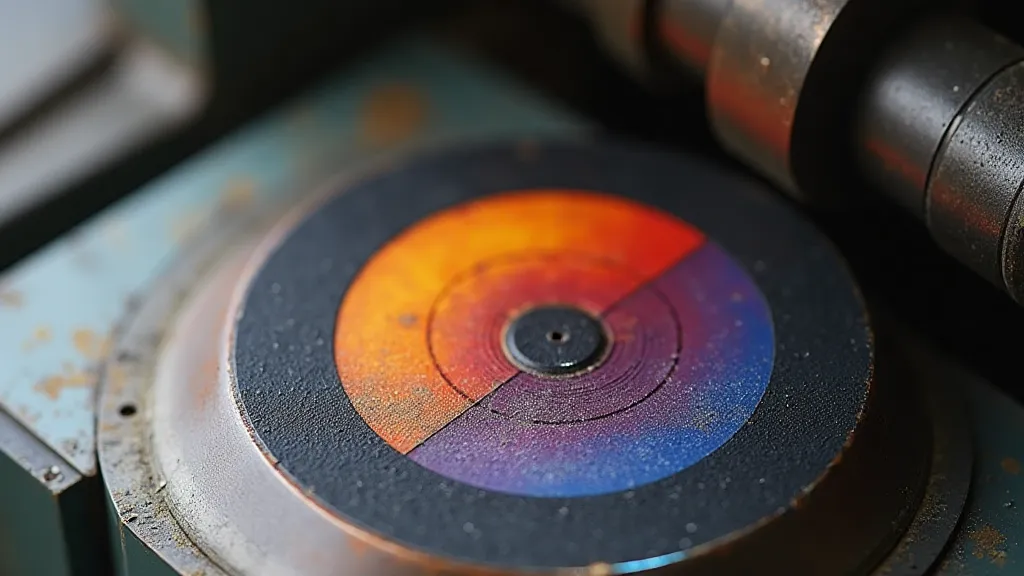
- Split Fountains: This is a more advanced technique where two colors are applied to the ink disc simultaneously, resulting in a gradient effect on the print. Mastering this technique allows for creating truly unique and eye-catching prints that showcase the full potential of your press.
Tips for Success
Ink mixing, like any craft, has its own learning curve. Many are embracing the resurgence of letterpress for its unique qualities, as explored in this look at the rise of modern letterpress. Here are some tips to help you on your journey:
- Start Small: Always mix small test batches of ink to ensure you achieve the desired color. This prevents wasting large quantities of ink if the result isn't what you hoped for.
- Record Your Recipes: Keep a notebook to document your ink mixtures – this will help you recreate your favorite colors consistently. Labeling your mixtures with specific details – ratios, brand of ink, paper type – will save you time and frustration later on.
- Consider Paper: The color of the paper will affect how the ink appears. Always test your ink on the paper you intend to use for the final print. The paper’s texture and absorbency play a big role in the final result.
- Cleanliness is Key: Keep your palettes, mixing tools, and workspace clean to prevent contamination and unwanted color shifts. Even a tiny speck of dust can alter the color.
- Experiment! The best way to learn is by trying things out. Don't be afraid to experiment with different colors and techniques to discover your own unique style. The more you experiment, the more you'll understand how different inks and papers interact.
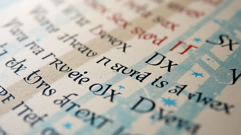
Ink mixing is an essential part of the letterpress printing process. It’s also a crucial element in understanding how letterpress differs from other printing methods, as discussed in this comparison of letterpress vs. other printing methods. By understanding color theory and experimenting with different techniques, you can elevate your prints from ordinary to extraordinary.
