Design Considerations for Letterpress: Creating Tactile Impressions
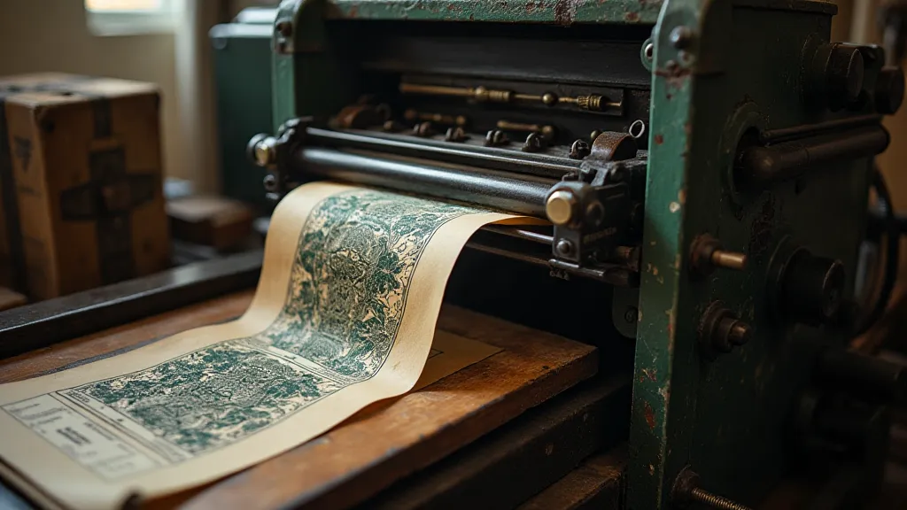
Letterpress printing isn’t just about applying ink to paper; it’s about creating a tangible experience. The unique pressure of the press leaves a distinct tactile impression – a depression in the paper that’s felt as much as it’s seen. To truly harness the potential of letterpress, design must be considered from the ground up, with the printing process as an integral part of the creative vision. This article will explore key design considerations specifically for letterpress, helping you maximize the depth of impression, choose appropriate typography, and incorporate visually compelling tactile elements.
Understanding the Letterpress Process & Its Impact on Design
Unlike digital printing, letterpress relies on physical pressure. This means heavy inks and thin papers can lead to smudging and uneven impressions. The pressure itself causes paper to compress and slightly deform, influencing the visual effect. Designers need to understand these limitations and leverage them to create impactful designs.
Depth of Impression: More Than Just Appearance
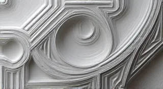
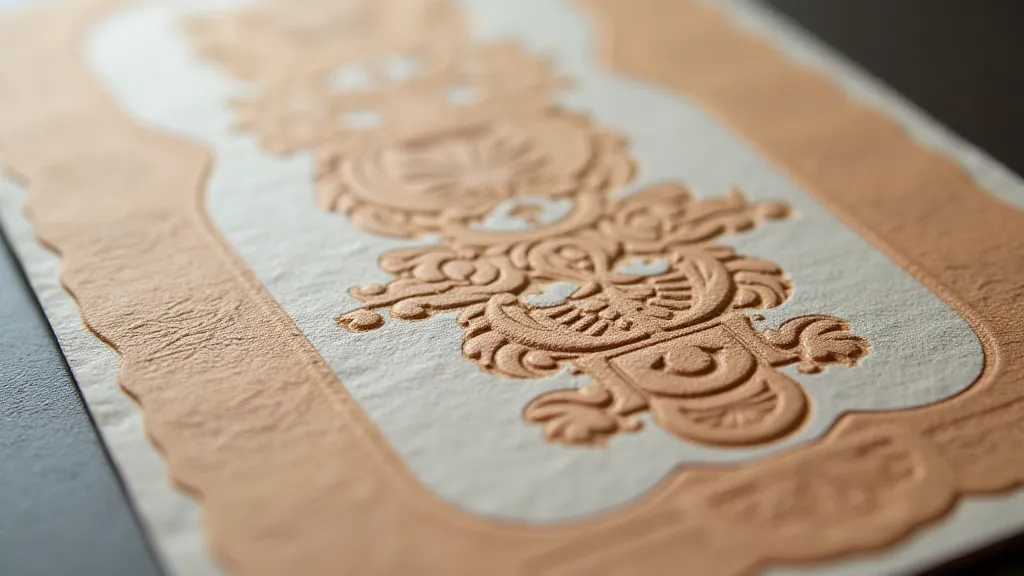
The “bite” or depth of impression is a critical design element. A deep impression creates a bold, dramatic feel, but it can also risk paper distortion and ink smearing. Shallower impressions provide a more subtle tactile experience and are gentler on delicate papers. Experimentation is key! Different paper types, ink formulations, and press settings will all influence the final impression. Think about how the depth of impression will affect the legibility of text and the overall aesthetic. A subtle impression might be ideal for elegant stationery, while a deeper impression could be perfect for a bold poster.
Typography for Tactile Impact
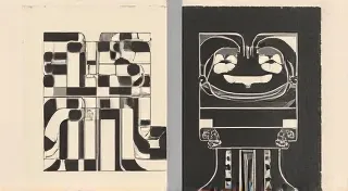
Typography plays a vital role in letterpress design. Bold, robust fonts with strong serifs tend to work well, as their thick strokes translate beautifully into tactile impressions. Consider the weight and spacing of your type. Tight spacing can create a dense, textured feel, while looser spacing allows the individual letterforms to stand out. Avoid overly delicate or hairline fonts – they may not register well under pressure. Also be mindful of kerning (the spacing between individual letters). Too tight kerning can cause letters to merge, while too loose kerning can make the text feel disjointed.
Strategic Use of Negative Space
Negative space, or white space, is just as important as the inked areas in letterpress design. Areas of negative space allow for a clean, crisp impression and provide visual breathing room. Clever use of negative space can also create subtle tactile elements – a recessed area that feels slightly different from the surrounding printed areas. Think about using negative space to highlight specific elements or to create a sense of depth.
Incorporating Tactile Elements: Beyond Type
While typography is the primary focus in many letterpress projects, don't limit yourself! Consider incorporating other tactile elements into your design. These could include:
- Blind Impressions: Areas that are pressed into the paper but receive no ink, creating a subtle recessed texture.
- Multiple Passes: Using multiple passes with different inks or plates to create layered effects.
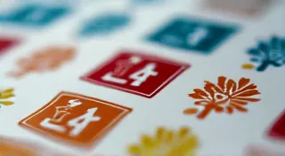
- Texture Patterns: Incorporating patterns or textures that are pressed into the paper.
Paper Selection: A Key Factor
The paper you choose will significantly impact the final result. Thicker, more durable papers (like cotton or linen) can withstand deeper impressions without buckling or tearing. Thinner papers will create a more delicate, subtle feel. Experiment with different paper types to see how they react to the press. Consider the color of the paper as well – a darker paper will enhance the visual impact of lighter inks.
Design Software & Workflow Considerations
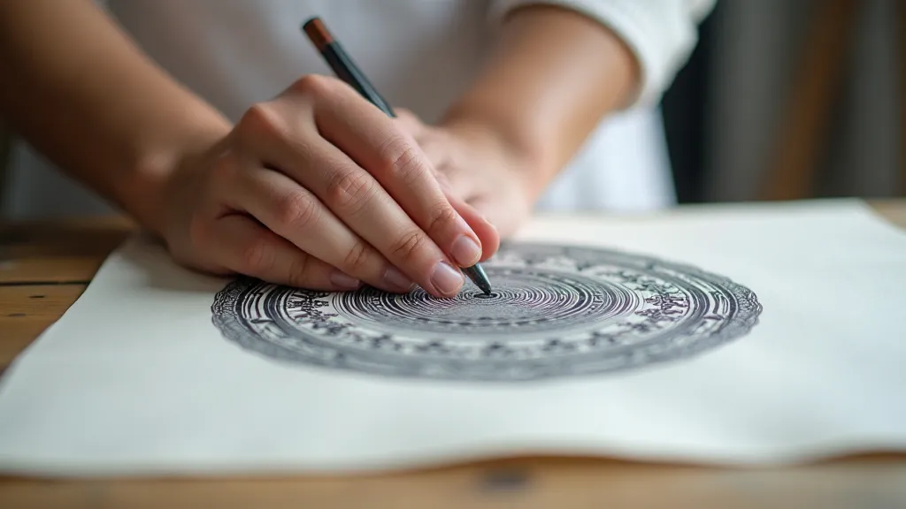
Designing for letterpress requires careful attention to detail and a understanding of how your digital design will translate to the physical print. Ensure your files are prepared correctly, with appropriate registration marks and trapping to account for the offset that can occur during the printing process. Work closely with your printer throughout the design process to ensure the final product meets your expectations.
Final Thoughts: Embracing the Process
Designing for letterpress is a rewarding process that combines artistry, craftsmanship, and a deep appreciation for the tactile world. By understanding the unique challenges and opportunities presented by letterpress printing, you can create truly memorable and impactful designs. Don’t be afraid to experiment and push the boundaries of what's possible – the best letterpress designs are often born from a spirit of exploration and collaboration.